Concept: Journal21
Details
- Role: UX / UI
- Team: army of one
- Industry: Mental health
Deliverables
- User research
- Persona
- Sitemap & user flow
- Wireframes
- Interactive prototype
- Visual design
- Style guide
Client
- Personal project
The project timeline
and my place in it
This project begin with a challenge: to build an ergonomic and beautiful app in only a week and a half.
The brief was vague: create a tracking app within one of the spheres of Wellness (Physical, Environmental, Social, Psychological, Emotional, Spiritual). After that, it was up to me which direction I wanted to take the project.
My goal was to find a digital way to help users increase their mental health and also track their progress towards better mental health. I provided a solution that put a focus on the main app function (joining group runs), allowing users to join in one click, search by location, and easily filter results.
Tools & skills used
The Design Thinking process took center stage here, but some of the other skills and tools I needed to draw on for this project were:
Sketch
Marvel
Principle
Adobe Illustrator
Design Thinking
Project management
Let’s back up a minute…
what is Journal21 about?
Mental health issues are universal issues; shockingly, the World Health Organisation estimates some 300 million people worldwide suffer from depression. Within that sphere, negativity and rumination are enormously pervasive issues. Did you know that National Science Foundation-funded research claims that out of the 12,000–50,000 thoughts a person has in one day, 80% are negative?
The Journal 21 conceptual app uses habit-training for positivity to combat some sources of depression, such as rumination and the negativity bias.
Concretely, what was
I responsible for, then?
I began with the Design Thinking methodology (Empathy, Define, Ideation, Prototype, Test). I followed the process and iteration quite strictly, since I wanted to make sure I understood each step of the process thoroughly.
Then I moved on to UI design based off a moodboard created for Daniel, the persona I focused on. Of course there's no solid line between UX and UI, but essentially I spent the first 6 days on UX and the following 4 on the UI (and presentation preparation).
Putting it simply: to create the main user flow for the Journal21 app MVP, I handled it all, from start to finish.
Want to hear more about it?
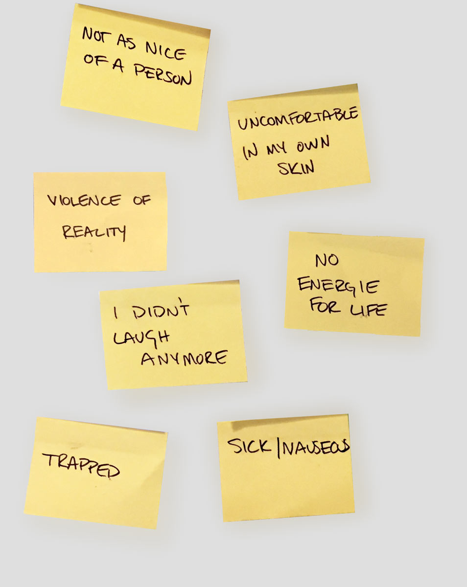
During user interviews, I focused on emotional and evocative language and getting to the true difficulties faced dealing with negative thoughts and rumination.
It was challenging at first to ask users about such a heavy topic as mental illness... I had to draw on all the emotional inquiry skills I'd picked up as a freelance researcher to put respondents at ease.
By asking open-ended questions about actual memories and experiences, I was able to gather deep insights.
Data from surveys and interviews allowed me to piece together empathy maps and affinity diagrams. I centered in on one user persona to build this MVP for: Daniel.
The problematic became more and more clear. How could I help David avoid negative thought cycles, increasing his happiness in the long-term?
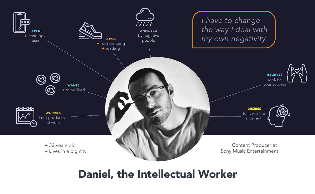
In my preliminary research I'd uncovered two things: Negativity is a habit. And... positivity is a habit! The app concept became evident: encourage positive habit-building by activities over the course of at least 21 days (the time it takes to build habits).
From sketched wireframes to interactive prototypes to completed screens, I iterated on my design many times based on user testing. For example, after looking at my user flow and listening to users, I actually removed an entire feature from my app concept. The feature was one I really liked, so it was a hard to let it go, to be honest. But that’s all part of the process!
On a short timeline (essentially 3 days for hi-fidelity screens), it was essential to prioritize where I spent my time. Though I didn’t have hours or days for logo design, it was still important to me to take a tiny bit of time to create something.
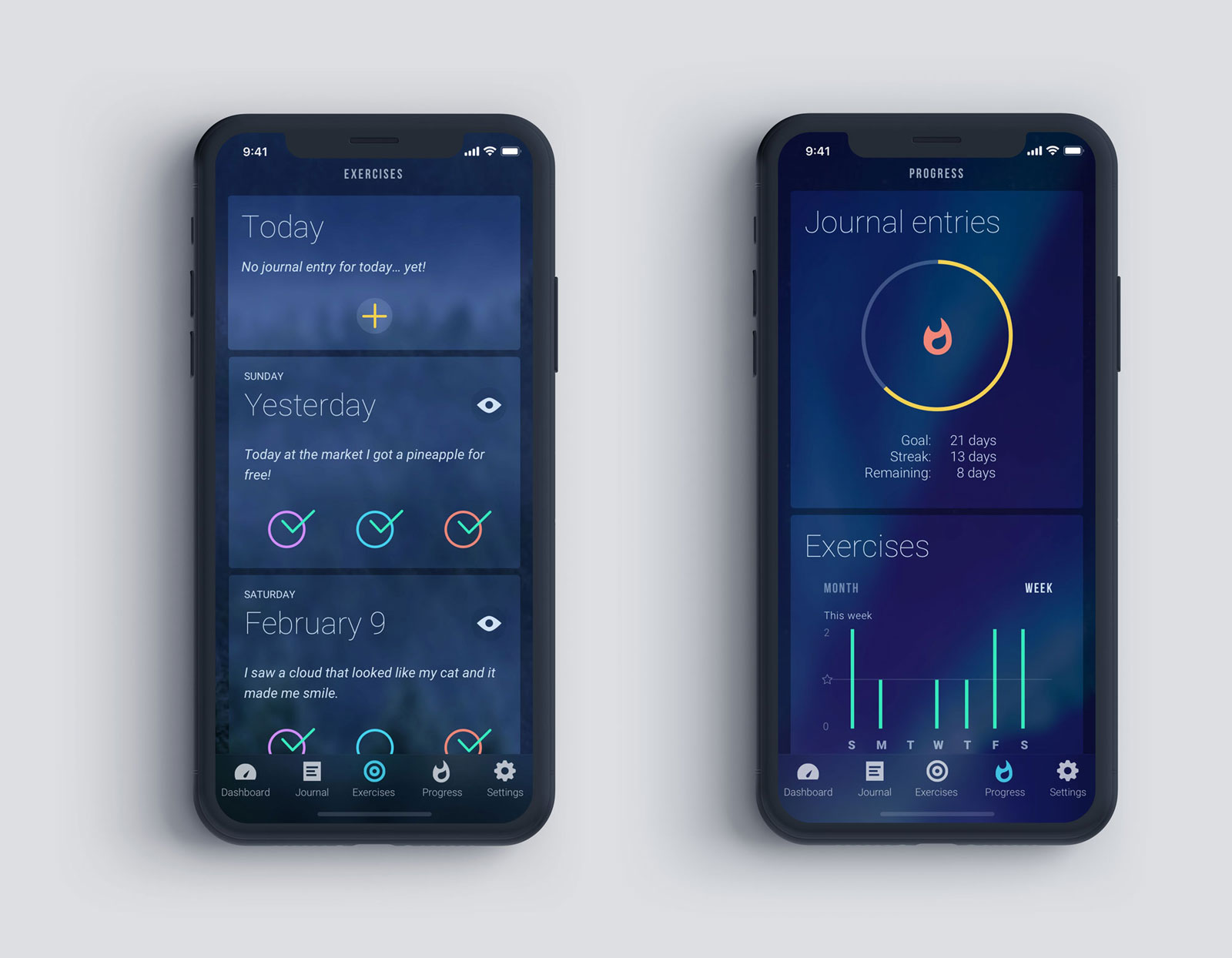
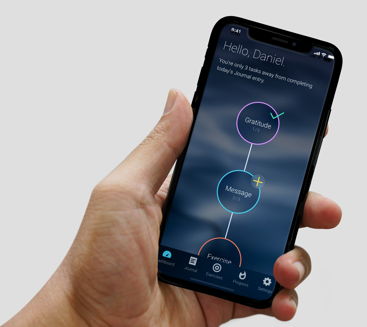
Go with the flow
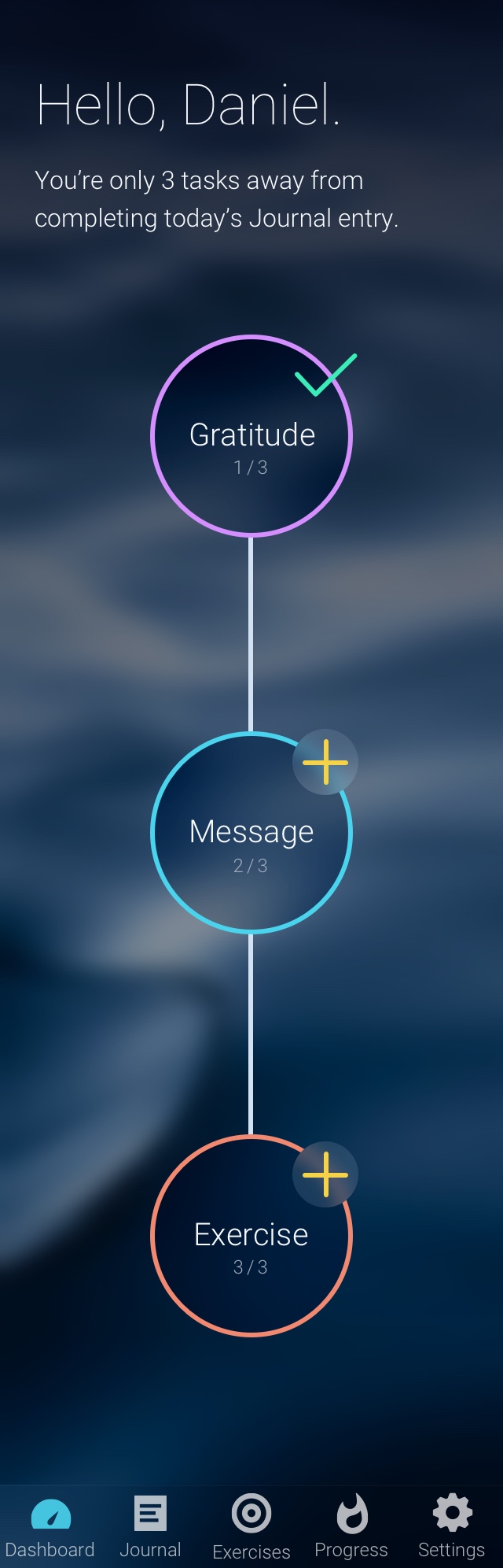
Home allows users to easily add their daily activities, even in a different order than recommended.
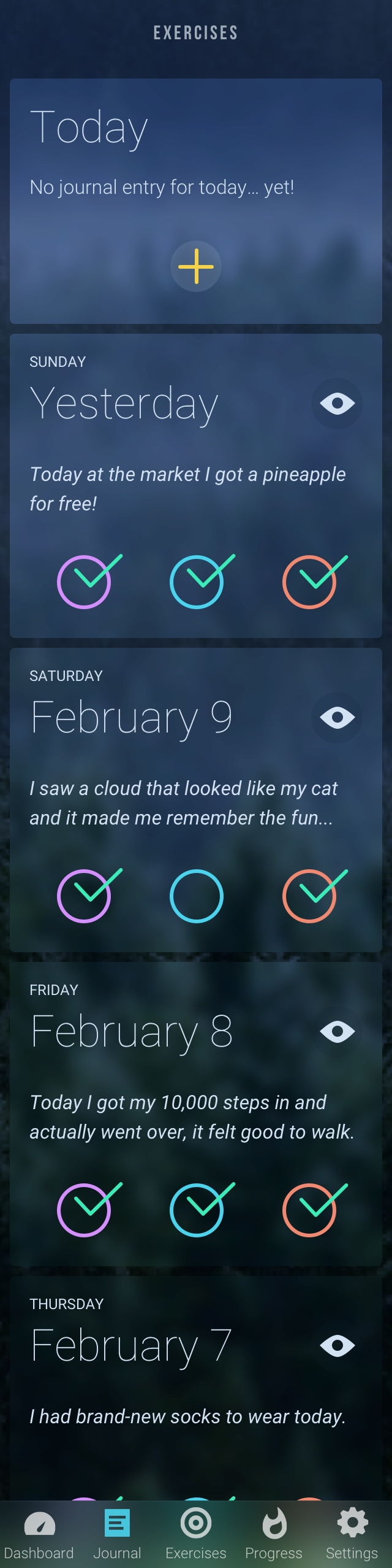
History of all journal articles
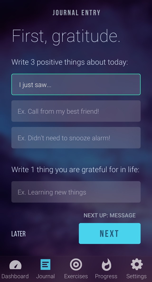
First of 3 daily activities - gratitude journal.
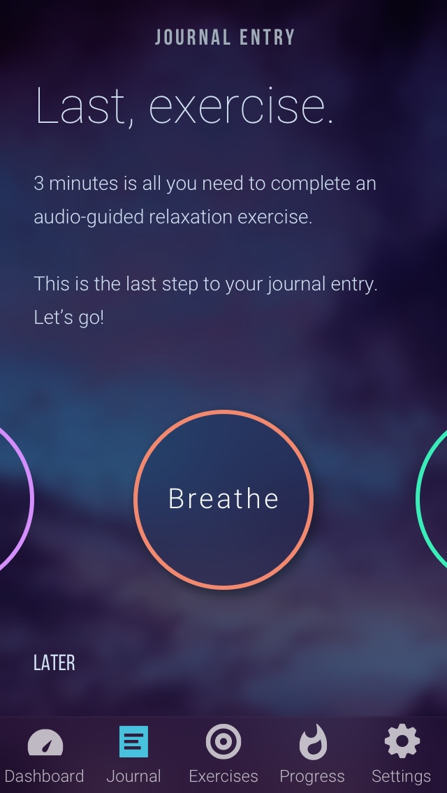
Daily activities end with a 3-minute exercise - suggested, but the user can swipe through alternate options.
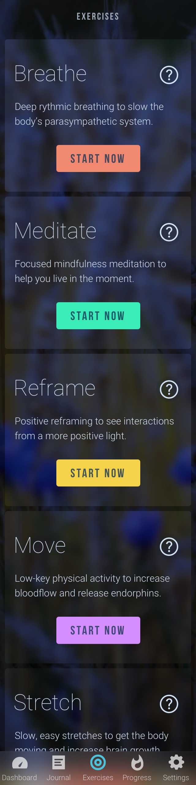
Learn more about each exercise, to satisfy the intellectual David's questions
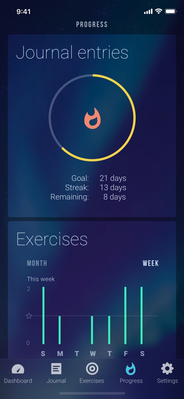
Track progress against the goals made.
Project takeaways:
what I learned, what I loved
Next time I would do multiple rounds of surveys; once to get a first idea of the landscape, and a second time to hone in on my target user category. Mental health is a big topic and I would like this app to be far-reaching. However, designing for everyone means designing for no one.
Since this was a personal project, I wanted to push myself on the UI in order to create something I’d never done before. I loved the challenge of building something in a totally different design than I had on the previous project. However, in the future I would match the UI more closely with the task - a dark mode for a positivity journal makes sense when considering that most users would fill it out at the end of the day, however it might not jive with the positivity aspect of the app as much as I would have liked.
