Client project: OuiMoveUp
Details
- Role: UX designer & researcher
- Team: 1 designer, 2 developers, PM
Deliverables
- User testing x 3
- Heuristic evaluation
- Site map restructure
- Wireframes
- New features
- Prototypes
- Visual design
- Style guide
Client
- OuiMoveUp
- for a gamified activity-tracking app
The project timeline
and my place in it
This redesign completely overhauled the UX of the app to provide the clarity users were lacking about the function of the app and their role. I also added new features to bring some feel-good social interaction to users.
The project finished up at the end of almost 4 months with a clearer process for users and an increased social-competitive aspect. I also created a new friendly, polished, yet unobtrusive UI - key to the OuiMoveUp business model.
The timeline was slightly less fast-paced as compared to previous projects. This gave me the flexibility to — at appropriate moments in the project — take the time to deepen my knowledge about psychology in competition, heuristic evaluations, data analysis, to set up a cost-free system for remote user testing, and more.
Any opportunity to learn is a driving force for me, so that was one special benefit to taking on this project.
Tools & skills used
I was able to expand my repertoire, digging deeper into Figma (though I also used Sketch due to changing client needs), Miro, as well as grow my understanding of heuristic evaluations and data analysis. I also got to stretch my graphic design chops!
Heuristic evaluation
Figma
Miro
InVision
Zeplin
Adobe Illustrator
Let’s back up a minute…
what is OuiMoveUp about?
The OuiMoveUp app is a platform for companies wishing to encourage their employees to be more physically active, while providing a cohesion-inducing competitive environment. Goals, challenges, and prizes are customized for each company based on their needs and desires.
The idea behind the app is periodic, time-limited Challenges. Employees sign up to take part, winning points based on the number of steps they take each day and additional fitness-related tasks they complete.
Having worked with the parent company twice before, I was excited to take on another one of their mobile apps.
Concretely, what was
I responsible for, then?
I wore many hats during the design of OuiMoveUp, which is one aspect I enjoy in UX-Army-of-One setups.
My primary responsibility was to create an environment that made sense to the user, while staying within the clients' needs and development budget. Users were not easily understanding the platform, their tasks, or how they could progress. Why was that, and how could I make OuiMoveUp more intuitive and frictionless?
On this project, I invested my spare time in digging deeper (through books and online classes) into each phase.
Heuristic analysis
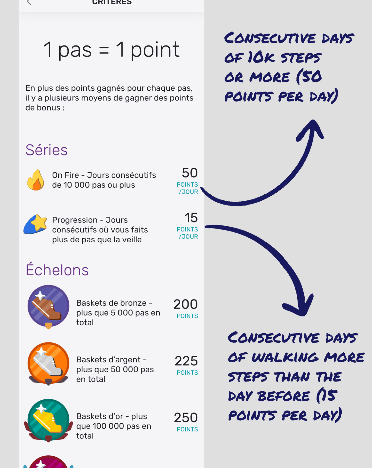
I performed a detailed heuristic evaluation and cognitive walkthroughs, pulling up new research to make informed design decisions. For example, I recommended getting rid of the cumbersome 6-screen onboarding tutorial. Nielsen Norman Group presented findingsrecently that concluded tutorials like this can actually make users perceive the app as more complicated (vs users' perception after skipping tutorial).
User Testing:
Research played a key role, since it was important to evaluate what was working and what needed to be revisited. I ran 3 rounds of remote user testing - this was happening at the beginning of Covid-19, so meeting users in person was not possible.
How can we ensure users understand what they need to do, without having to refer to a FAQ screen or heavy onboarding?
Psychology research:
I dove deep into the psychology of gamification, competition, and rewards, steering the team towards a solution that incorporated competition against one’s past self, instead of against colleagues (many of whom the user wouldn't know in real life). I want to be sure I enable positive behavior for my designs, and this was an important point I stressed to the clients, in terms of responsible design and user wellness.
I also pushed for a focus on intrinsic, rather than extrinsic rewards, since research shows intrinsic rewards are typically more long-lasting.
Ideation facilitation:
I organised and facilitated a remote ideation session with key stakeholders (company founders, developers, and sales) in a remote yet collaborative setting on Miro. Read more about my process here.
Information architecture:
I ended up solidifying an app architecture that made sense, streamlining things even as I added new features.
Though I would have liked to test the structure with users through card-sorting and general usability studies, since we didn't have the resources I used both benchmarking from relevant popular apps, and heuristics to make the most educated guess at the best design decisions.
Prototyping:
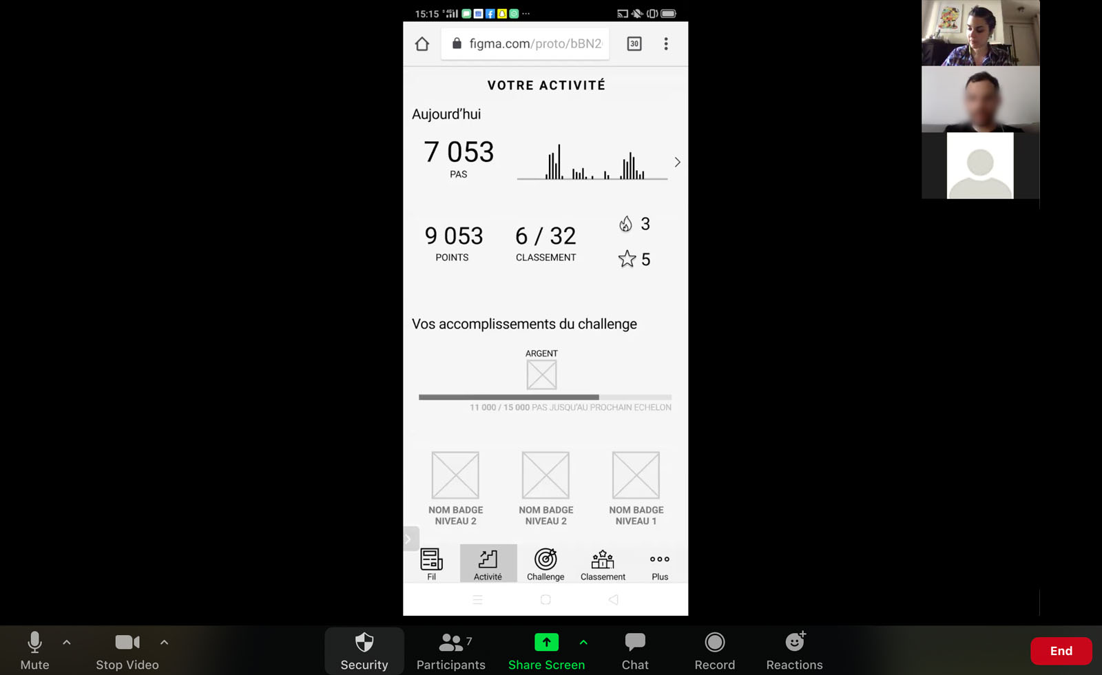
Due to evolving client needs, I built interactive mid-fidelity prototypes on Figma, and high-fidelity prototypes on InVision. I used these to test with users as well as to communicate with the client and development team.
Wireframes brainstorm & testing:
As with any user-centered design approach, I sought out user feedback at every stage of the process I could (in this case, at 3 key moments in the design) and iterated on the design each time. Wireframes were hugely important to test since I could make needed changes without much time lost — and before I became too attached to the designs. Many of the screens and concepts evolved due to user feedback.
Anything else?
I'll focus less on these since they are not pure UX... but I think these parts of the project are important to increasing my skills and understanding as a UX who doesn't only work in a silo.
From understanding the business goals now and in the future, to flexing my graphic design chops, to focusing on research, these are things I'm proud of.
- Data analysis to help inform decisions
- Formation of strategy for metrics and performance monitoring `going forward
- Cognitive walkthrough and expert heuristic evaluation
- Recommendations to client for future functionality of Newsfeed
- Full style guide including extensive recommendations on microinteractions, copy, and more
- Client training session & guide on user research, recruitment, and best practices
- Polished and unobtrusive UI design based on client needs and moodboard
- Atomic design to ensure coherence and facilitate developers' jobs
- Conception and graphic design of all badges and icons
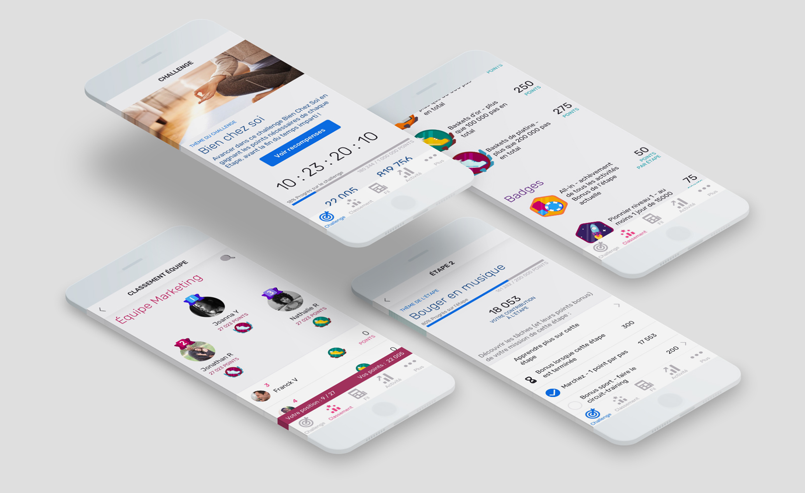
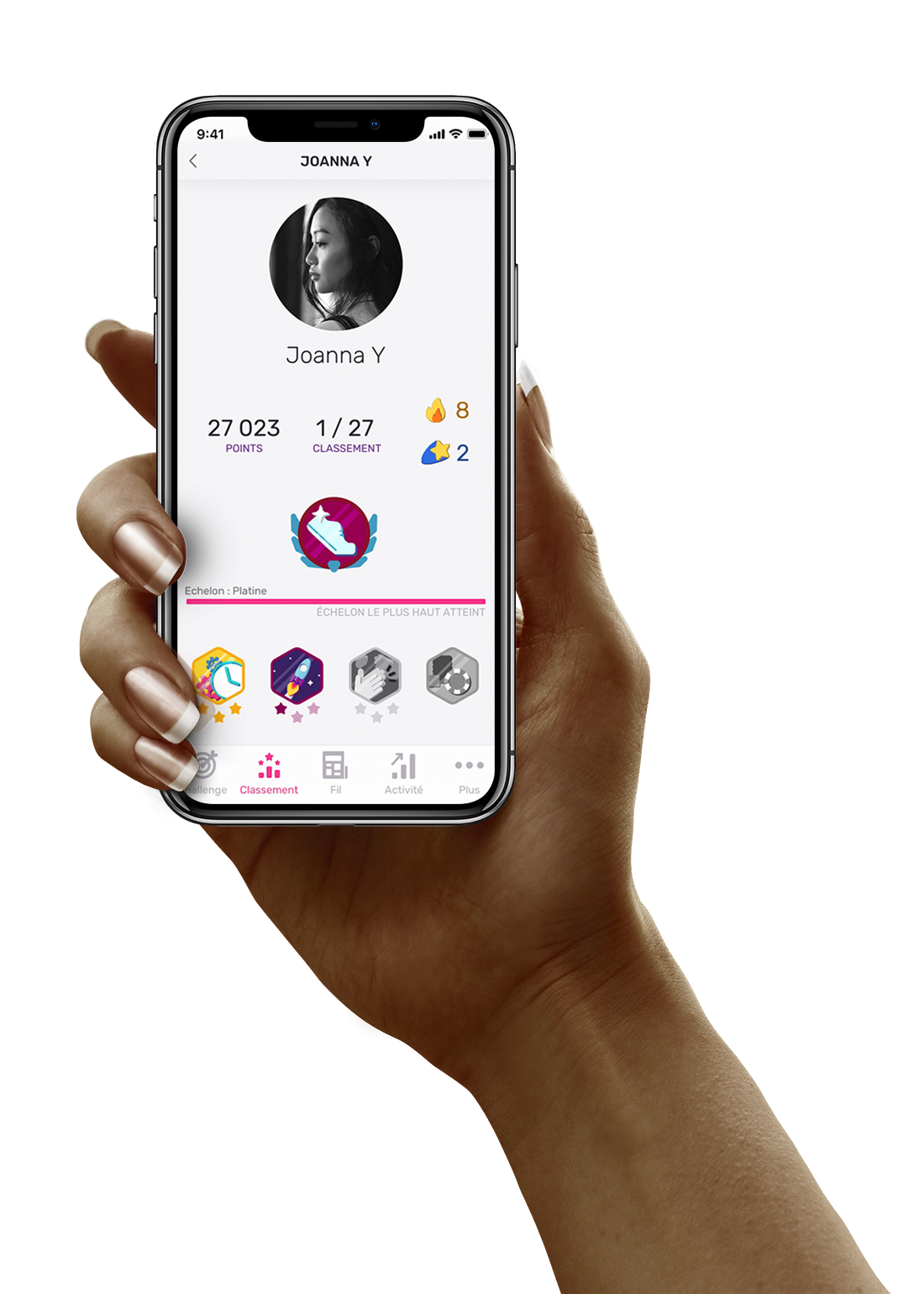
The finished product
The UI is clean yet playful - appropriate for an app that is encouraging activity through competition.
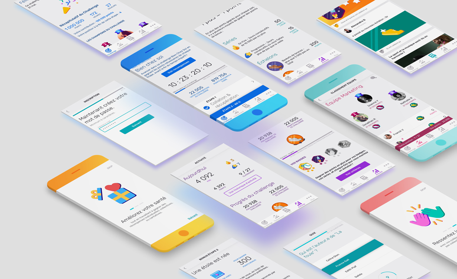
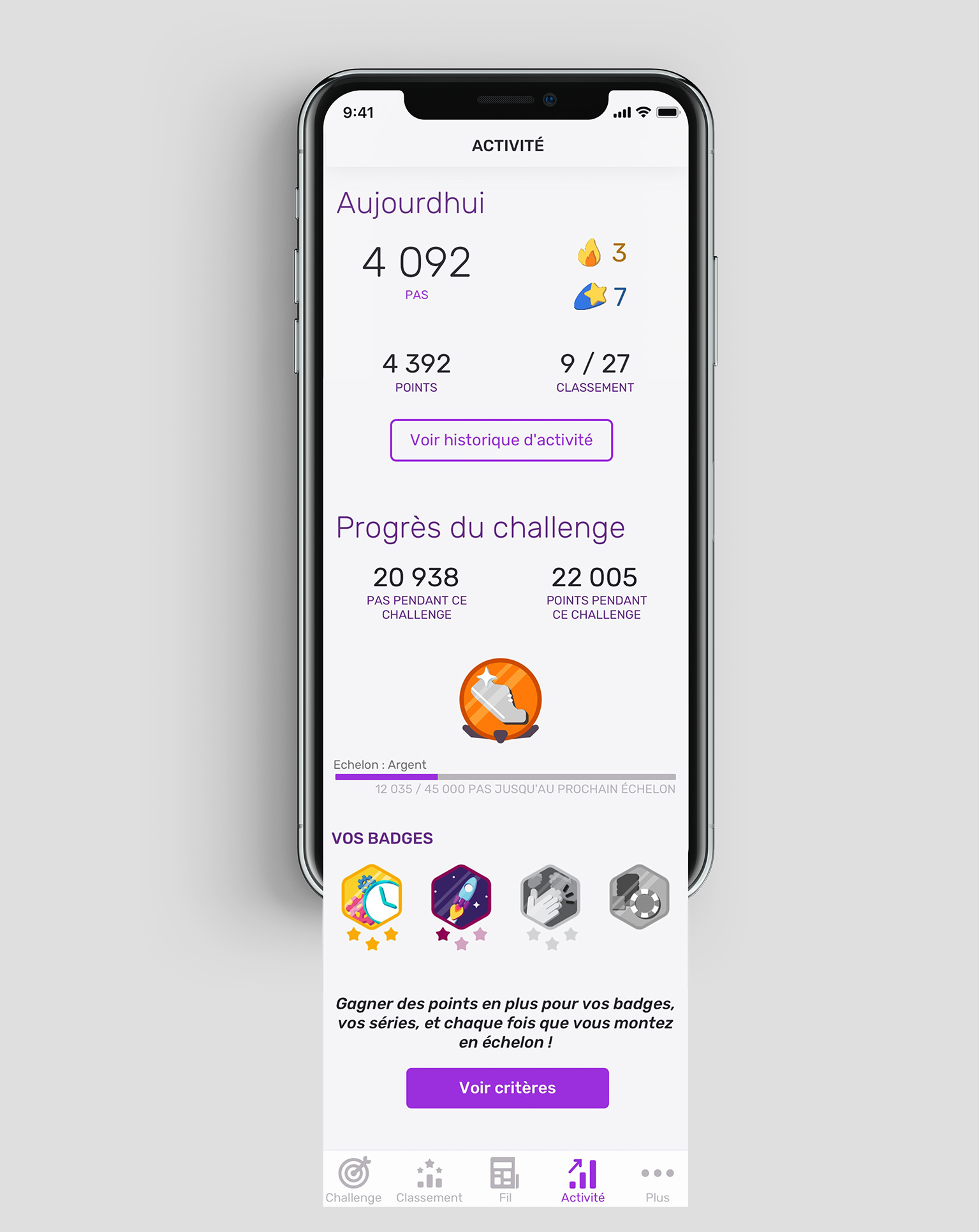
The activity screen was cleaned up from previous designs, providing visual hierarchy that reflects the importance of the information to the user and to the Challenge.
I also made changes based on the development team's constraints.
Project takeaways:
what I learned
As with any short project, a designer's wish is often to have more time, more resources, more research. However, projects like this teach me that in the real world, we don't always work under perfect conditions. We have to roll with the punches, deliver smooth and intelligent experiences in any situations.
To help be sure I was designing in the best way for our user, I deferred to user studies others have done, best practices in UX and UI, and up-to-date inspiration. It was very important to do the 3 rounds of user testing, but this secondary research is an additional type which is also very important.
Every challenge is a learning experience. This was my first time working 100% remotely with the team, and to say I learned a lot is the understatement of the year. I discovered the essential nature of tools like Zeplin comments, email, and phone, to be sure we were on the right path. What I would do in the future in a similar situation is propose a screen-sharing video call to walk through the app flow and functions, and to ask questions in real time as I navigated the app. I think this would have saved time (writing thorough emails and redesigning screens is a lengthy process!).