Client project: Mabbly X Tolmar Pharmaceuticals
Details
- Role: UX designer & researcher
- Team: PM, Brand strategist, SEO, UI, Dev team
Deliverables
- Wireframes
- User testing
- Site map
- User flows
- Prototype
- Documentation
Client
- Mabbly
- Tolmar Pharmaceuticals
The project timeline
and my place in it
This 4-month project came at the end of the Mabbly team’s branding and strategy work for Tolmar Pharmaceuticals. Tolmar is a relatively small, mainly USA-based laboratory creating treatments for prostate cancer and central precocious puberty.
The goal was to design a digital solution to help sales professionals who, due to the pandemic, are not able to meet face-to-face with Health Care Professionals (HCPs). This made effective communication and knowledge transfer difficult, given the traditional nature of sales presentations.
Thanks to user research and mindful use of usability heuristics, I was able to design an online resource center that was intuitive to both primary target users (HCPs) as well as secondary (sales professionals).
Working with this large and diverse team, I learned a lot and adapted to the team's style and needs, while still remaining an advocate for the user.
Tools & skills used
I was introduced to Abstract on this project and enjoyed learning a new product. I also put my UX content writing chops to good use!
Sketch
Abstract
User testing
Information architecture
UX writing
Responsive design
Concretely, what was
I responsible for?
This was a full-range UX project following user-centered design priniciples, which had been essential in my pitch to the client.
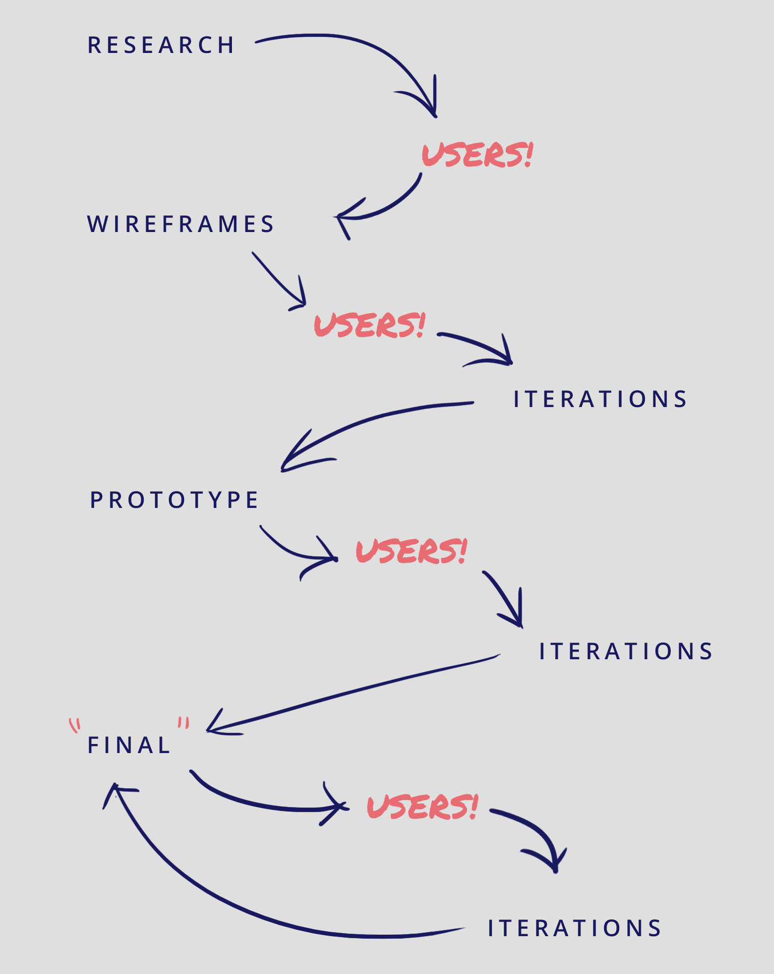
I had a very strong focus on users, solliciting their feedback at several times throughout the design process.
My responsibility was to be a relatively autonomous part of the design process, collaborating with the team at key stages but mainly owning and running the entire UX phase.
Research
As lead UX designer, I ran a thorough preliminary research phase, digging through existing primary sources to understand users’ pain points and needs, as well as becoming familiar with the disease states for the dual project.
How might we create a digital resource that helps the sales force clearly and simply communicate all necessary technical and medical information to HCPs?
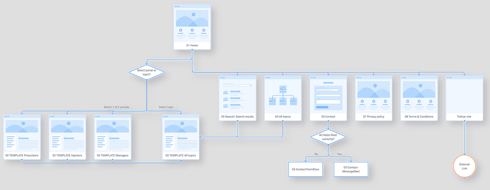
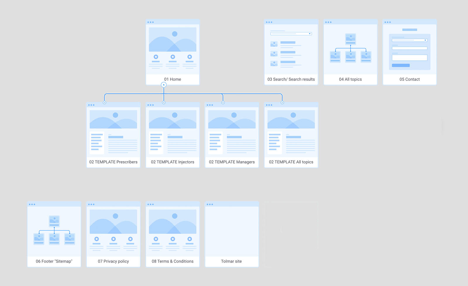
Information architecture
This allowed me to build a site architecture that was extremely simple with page hierarchy remaining quite shallow - an important need for the target users.
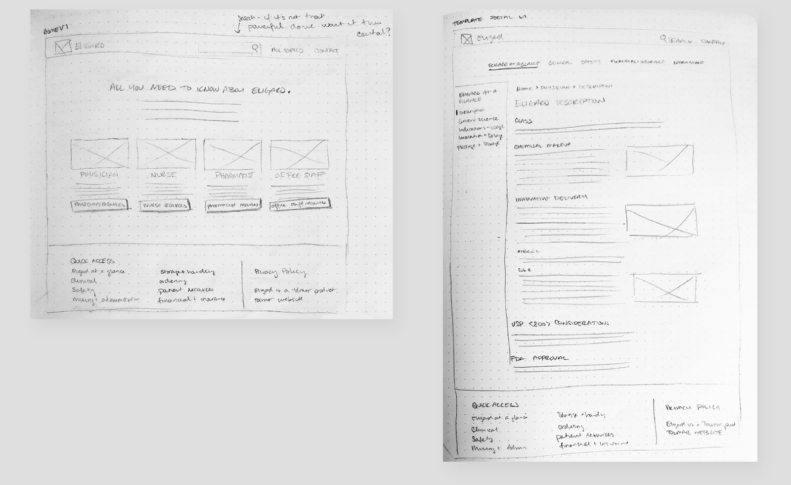
Wireframes & content
I moved on to several iterations of low-fidelity wireframes, seeking feedback and insight from the team each time.
After collaboration with Mabbly’s SEO team, I was able to refine my mid-fidelity wireframe copy using best practices for UX writing, and knowledge of target users. Then it was on to testing with users!
Testing
I defined research objectives and after approval from the client, mapped out the testing guide and scheduled 30-minute testing sessions with users.
Having that user feedback on the mid-fidelity prototype gave me important insights to improve both the copy and the design.
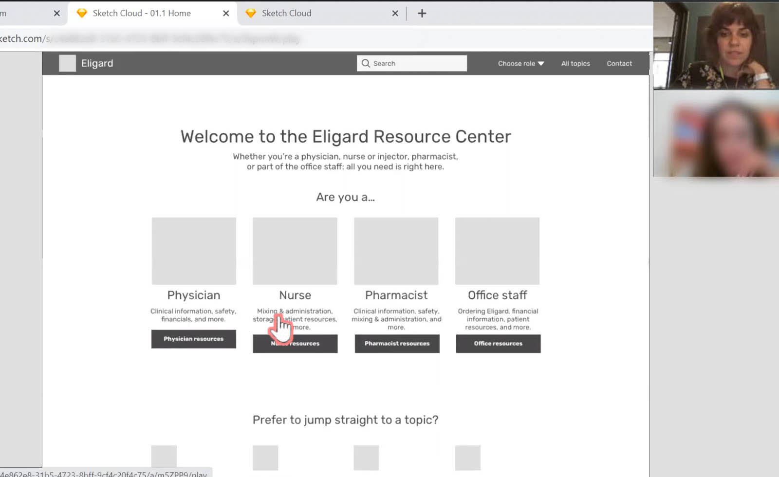
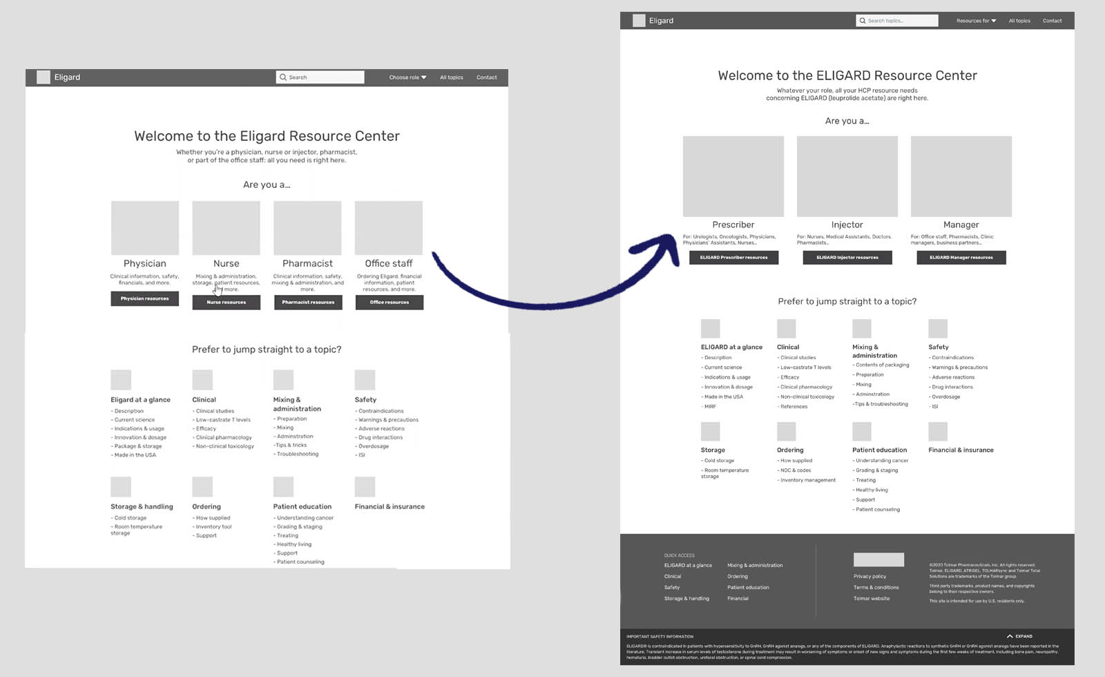
For example, I slimmed down resource ‘portals’ from 4 (based on the HCP’s title) to 3 (based on the actions the HCPs would be carrying out).
Another change was allowing the user to see and access all topics directly from the homepage (these were situated underneath the user 'portals').
Delivery
I iterated on the wireframes following user, client, and development team feedback in order to balance the needs of everyone involved.
After, I delivered a content master document, documentation detailing edge cases and interactions, the Sketch file of mid-fidelity screens (through Abstract), and my list of UX recommendations for the project moving forward.
Project takeaways:
what I learned
For UI and development needs, Mabbly has designers and developers in a different country. The first handoff went well initially, but later we found that there were many precisions that I had omitted or looked over entirely… when working in very technical content with a team whose English is spectacular but not native, even the tiniest lack of clarity can cause a lot of confusion.
The post-handoff situation created extra work for everyone involved.
In order to avoid this on the second part of the project, I specifically requested a meeting with that team in order to get their input and validation for a new system I’d been creating for the Content Master document. I explained the constraints on my end then proposed my solutions for each area we’d had difficulty with on the previous round. The open communication allowed me to provide a clearer document for that team.
Lesson learned: treat UI and dev teams like your users… Think about things from their perspective, ask questions, and present solutions for open-ended feedback until you know what’s best for that group!
What they thought about my work
Mabbly team
Your commitment to making the process clear, while remaining flexible and amenable to the needs of the Mabbly-side team, made your already wonderful UX skills even more valuable to us. Can't wait to work with you again!