Client project: Capgemini x Synlab
Details
- Role: UX / UI
- Team: 3 designers + 5 developers + PM
- Industry: Education
Deliverables
- User flows
- Sketched wireframes
- Client workshops
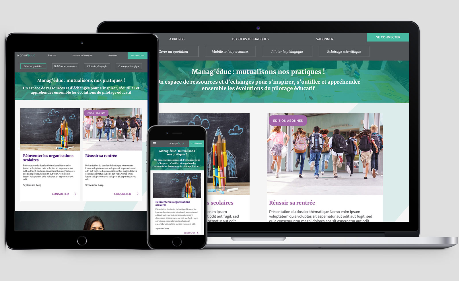
- Responsive visual design
Client
- Synlab
- For the Manag'éduc platform
The project timeline
and my place in it
I worked as a UX / UI with the Capgemini Creative Design studio during the final 3 months of the Manag’éduc platform construction and launch.
The project had begun about 2 years before, and a fair amount of the site was already designed for desktop. However, there was still much to be done and an extremely tight timeline.
My goal in collaborating with Capgemini was to gain experience in a real-world environment, while bringing new ideas to the table and continuing to learn. I wanted to help streamline the creation of responsive screens (due to client demand the platform was built desktop-first), create intuitive and well-researched user flows, and add my own brand of visual design where I could.
Tools & skills used
Sketch
Zeplin
Marvel
Adobe Illustrator
Google Sheets collaboration
Scrum
Let’s back up a minute…
what is Manag'éduc about?
Manag’éduc is a platform aimed at helping mainly French heads of school find resources and a supportive community of others in similar positions. Being a head of school is a rather lonely position; because they are state employees they don’t have the feeling they can openly share frustrations or problems. They are also alone in their roles, being at the top of the pyramid in the school.
Manag'éduc provides tool worksheets, interviews, whitepapers, infographics, and a community to these users.
Alienation
Position of authority makes Head of School a lonely position
Fear
As government officials, Heads of Schools don't feel they can speak out without repercussion
Concretely, what was
I responsible for, then?
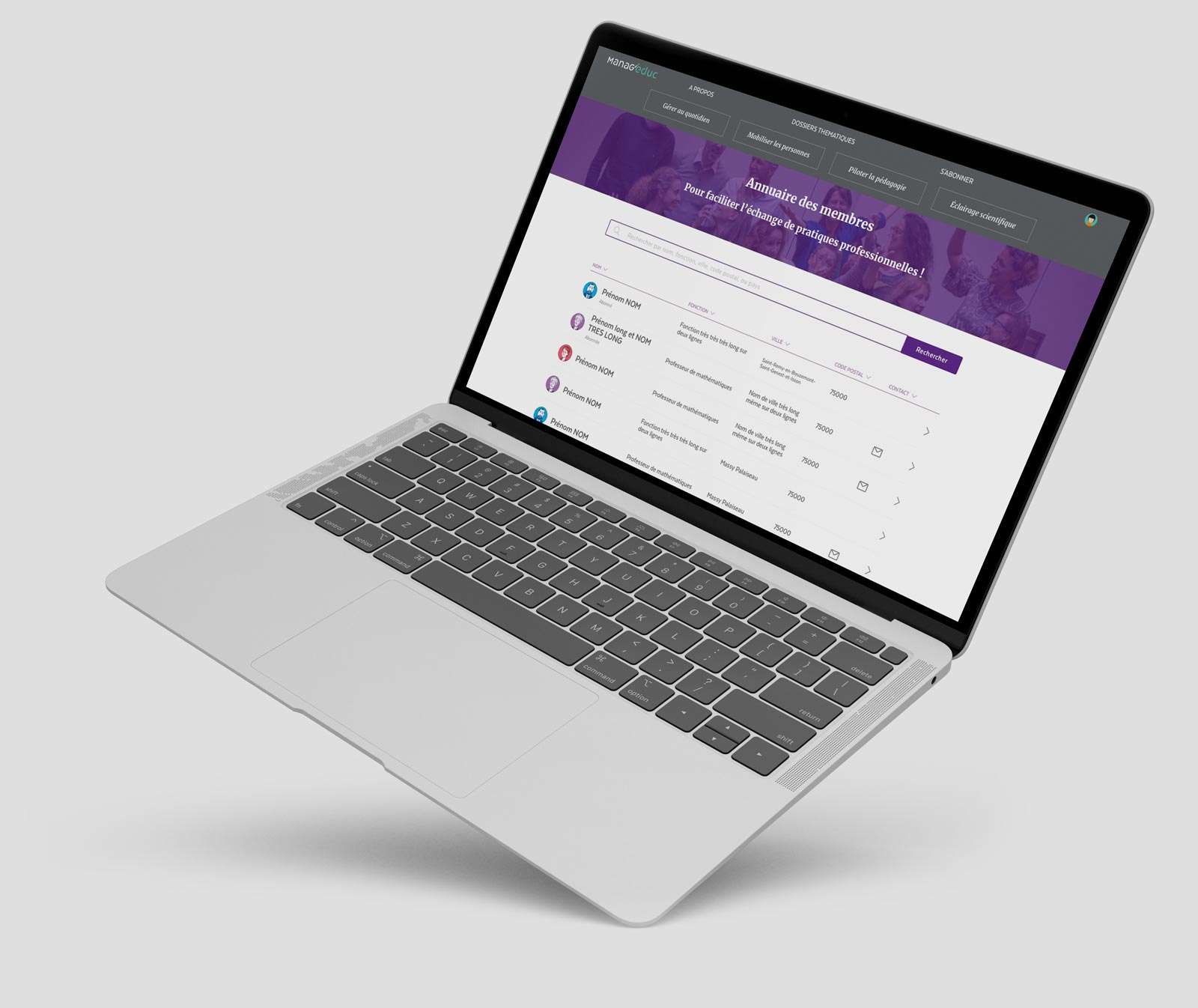
From sketched wireframes to final mockups, I created several needed user flows through the system (subscription and payment process for users, back office member and subscription lists, back office account creation and promo code creation, and more).
I also handled creating the responsive layouts for many of the screens that had been created on desktop. This involved collaborating with the UX and UI, development team, and client, as well as responding quickly to frequent screen modifications.
Want to hear more about it?
I worked closely with the lead UX to create an intuitive environment for the user, while resting within extremely tight constraints from the client and development team.
Though the UI of the site was already quite fleshed out, there was still plenty of UI work to be done. I autonomously created small details such as icons, designed new UI elements as they became necessary on various user flows, and influenced larger aspects of the site like standardising modal sizes and margin rules.
I autonomously presented my screens in workshops between the project manager and the client, brainstorming possible solutions and rapidly responding to feedback and necessary modifications.
The most efficient work in the project came from open and frequent communication with the development team - not only at the handoff, but well before.
User flows
It was important to reiterate on certain user flows to be sure they were as intuitive as possible for the user.
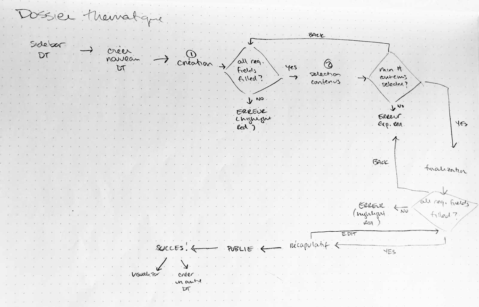
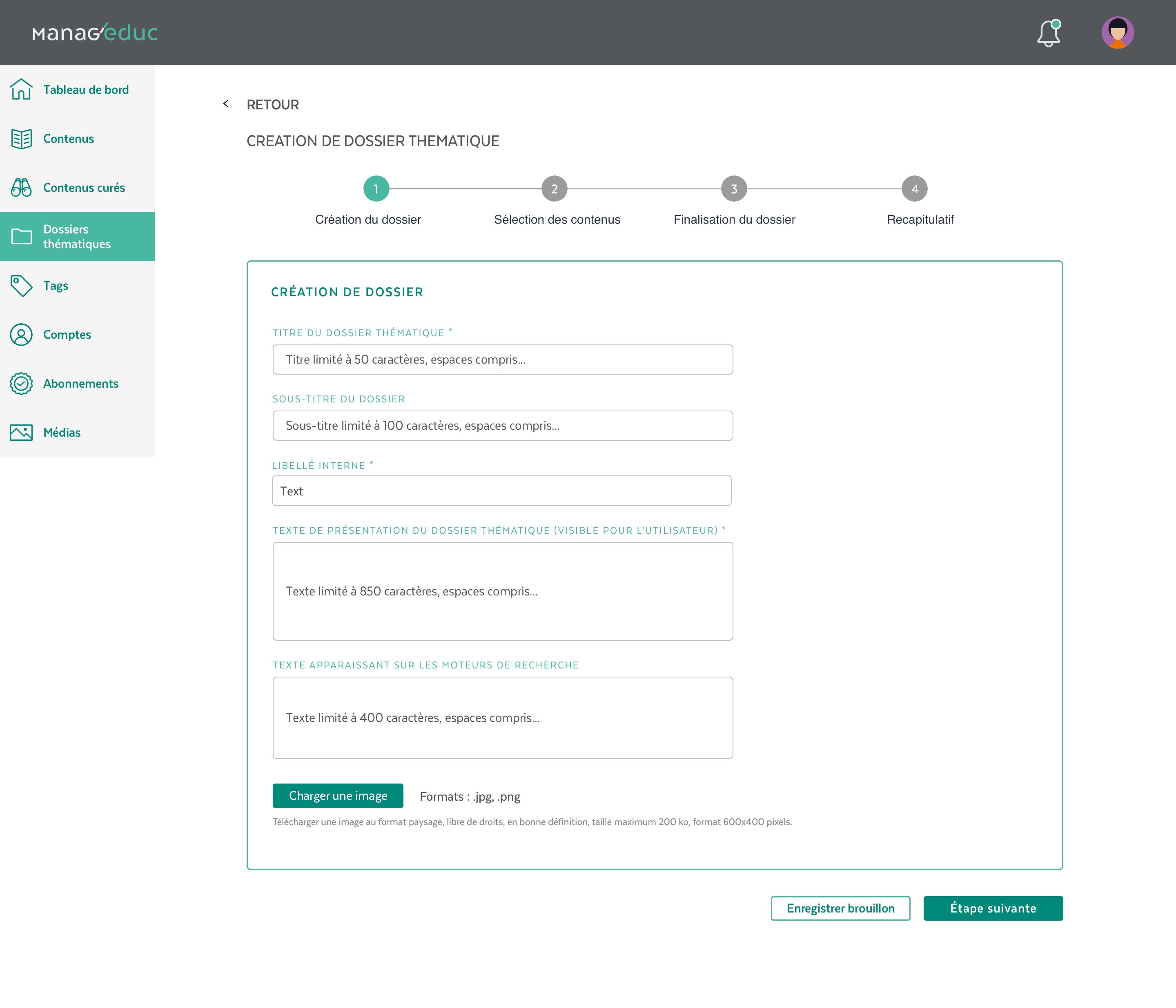
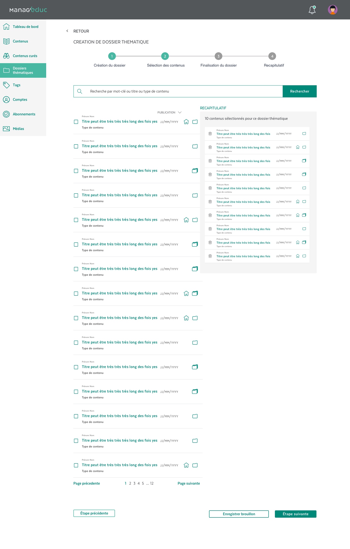
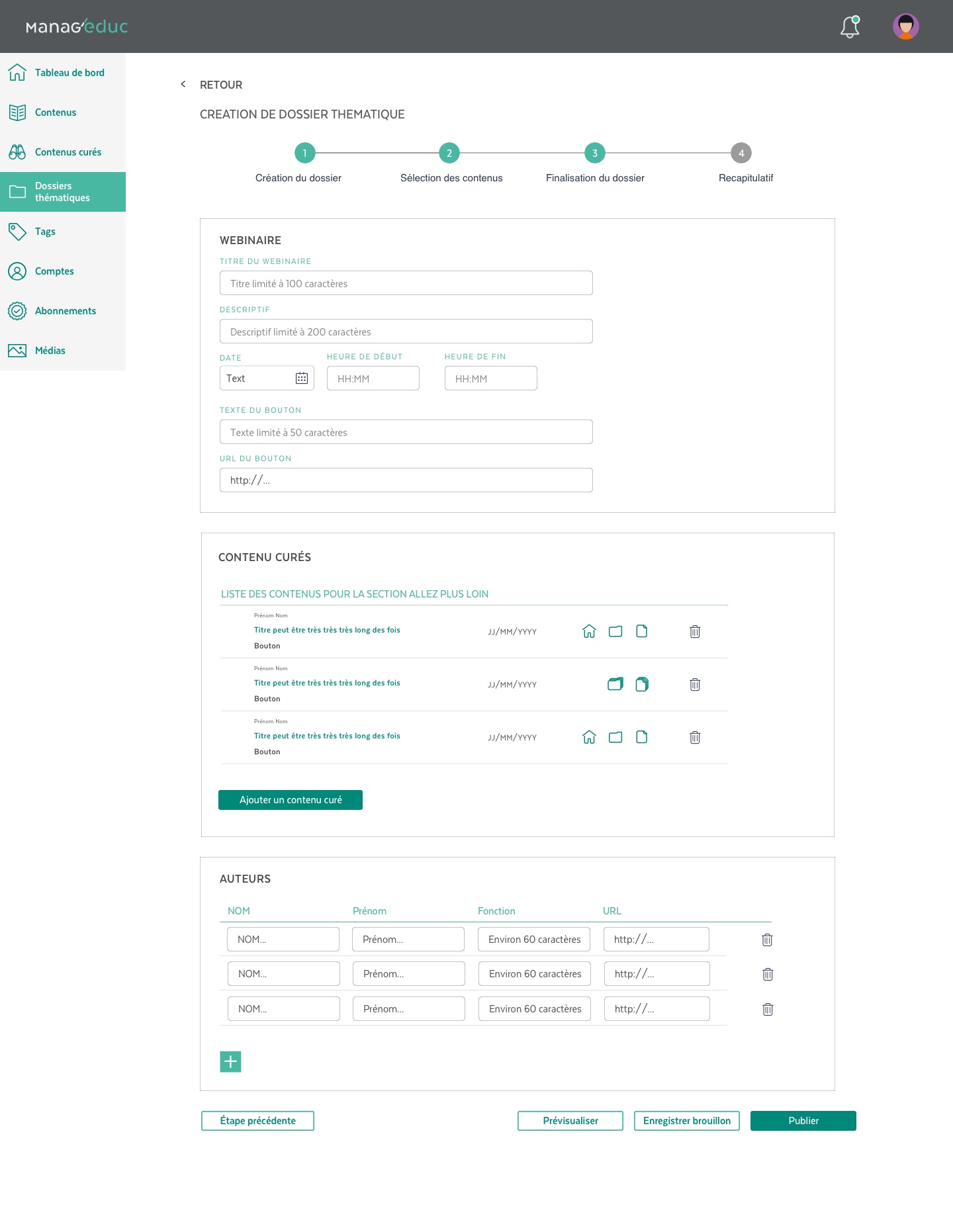
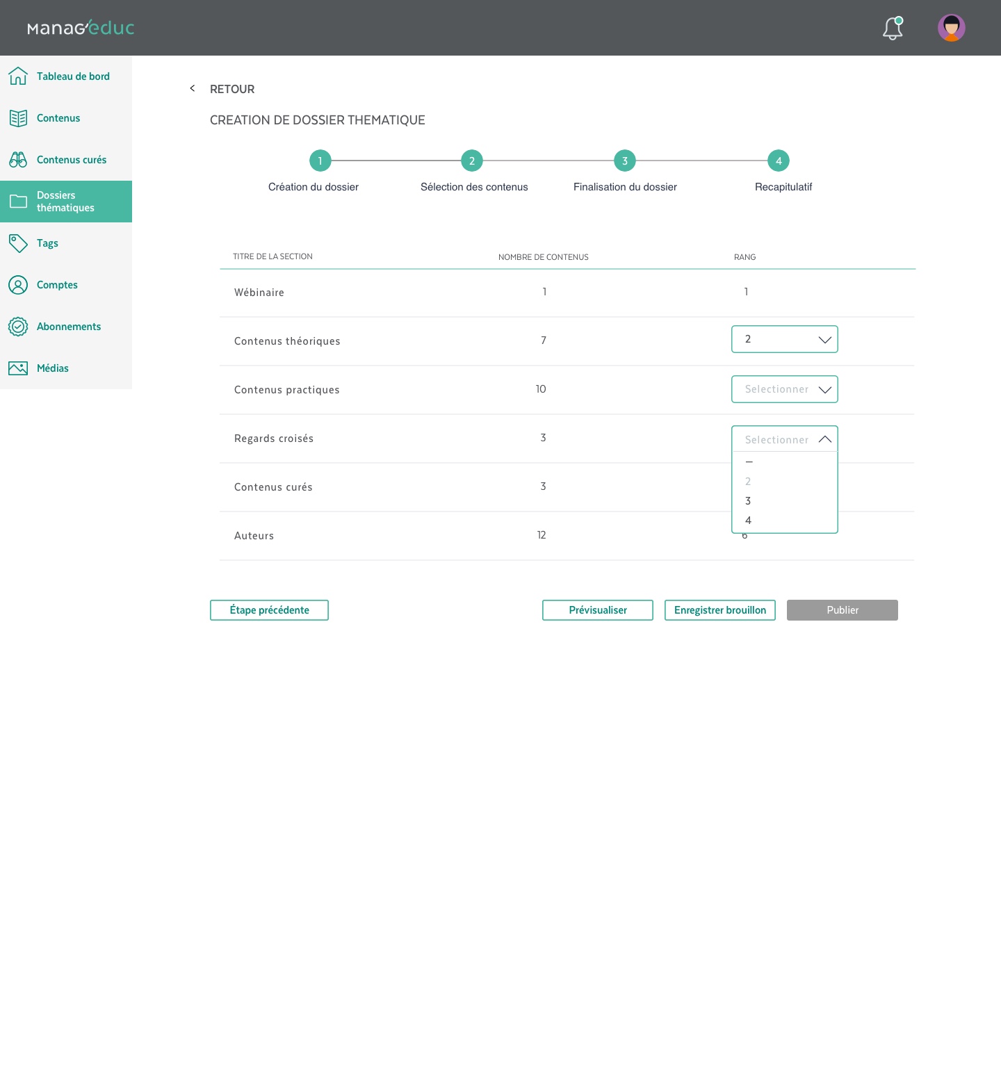
In this example of a Education pack creation, I implemented an additional step (recap) to ensure users would not make public changes unwittingly, encouraged a Save draft button as well as warnings when a user attempted to leave a page without saving.
Due to development team constraints, some preliminary ideas had to be rethought. For example, the original plan was to have a very visual drag-and-drop organization of content and content types on the final Education pack. This wasn't possible so I found solutions such as the numbered drop-down ranking.
Wireframing for quick concept testing
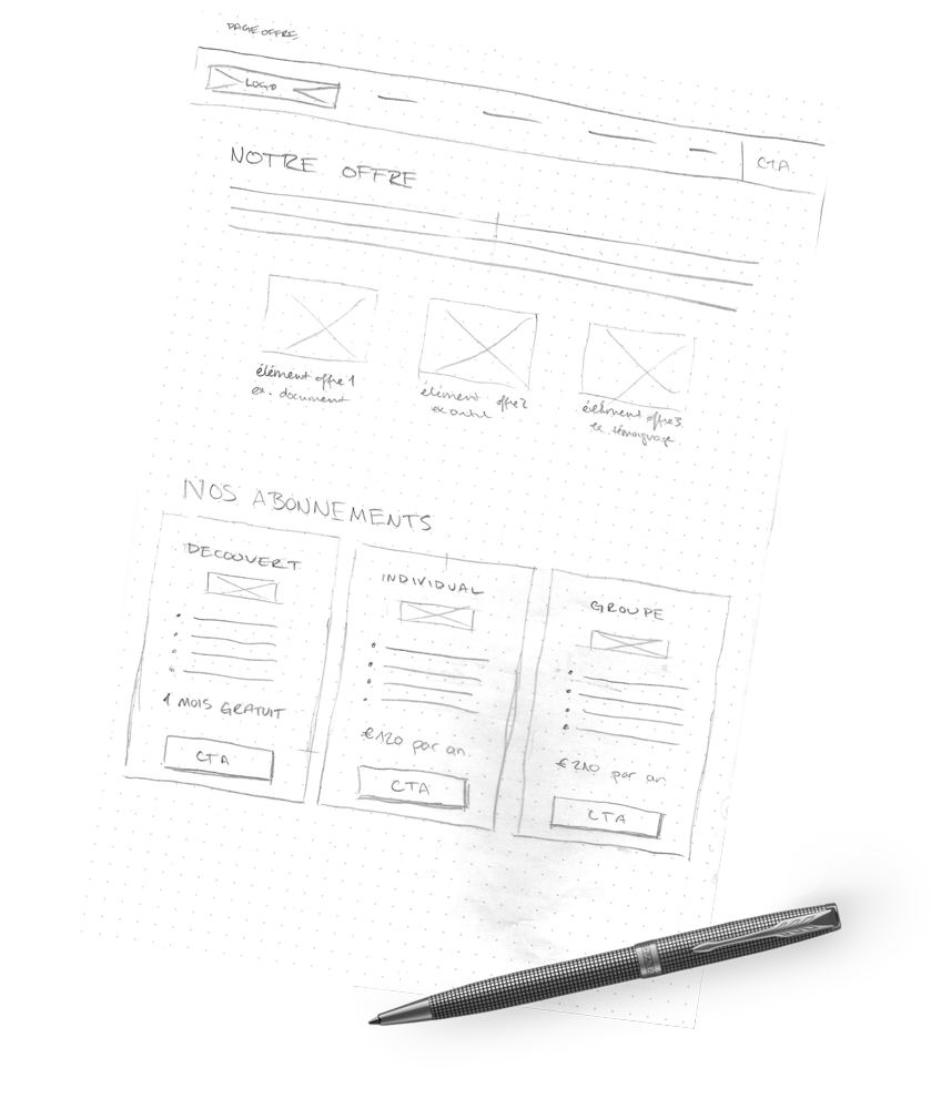
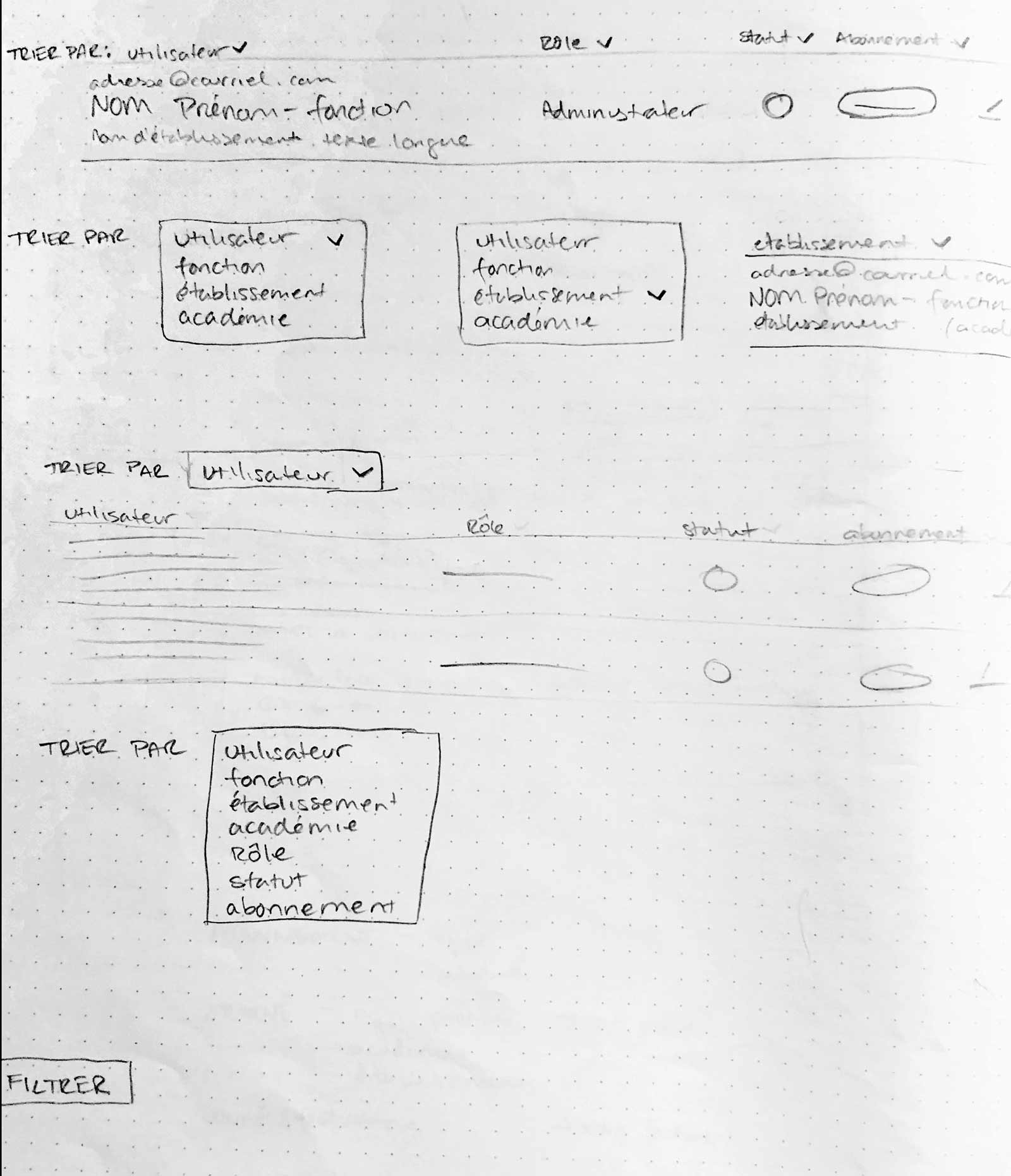
Many aspects of new and reworked screens were first sketched as wireframes with pen and paper. This allowed quick feedback from the dev team and PM, without spending a lot of time.
Here are several iterations on sorting solutions for search on the front-end user directory.
UI + Design system
From helping to create the Design system (including responsive adaptations), to creating new high-fidelity screens, to even autonomously designing icons as needed, I contributed to the UI design in a substantial way.
Responsive design
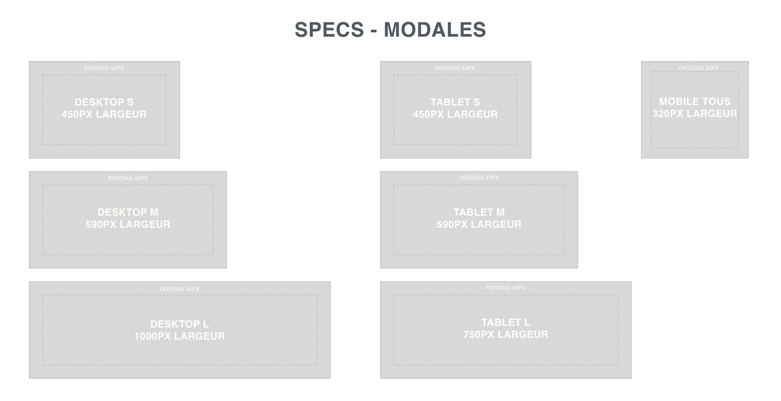
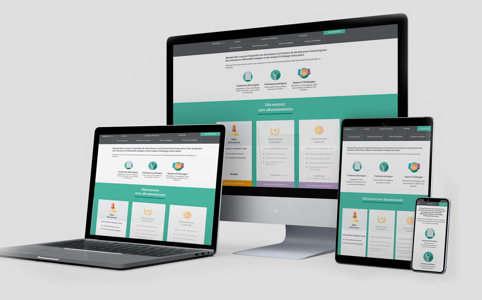
Due to client and user needs, the platform was designed desktop-first. Though Back office would stay desktop-only, I was put in charge of handling responsive breakpoints, interaction, and general design. I communicated these changes in ways to help the entire team know about them as easily as possible - for example, uploading modal specs to Zeplin and alerting both dev and design team members.
Project takeaways:
what I learned, what I loved
I really got my feet wet, from handling challenging (and changing) client demands, to speaking with developers to understand what was possible and what had to be reworked, to the importance and utility of an organised design system.
My biggest takeaway though was the importance of open and constant communication with the development team... a lesson I learned the hard way, but thankfully at the very beginning of the project!
What they thought about my work
Deborah Decottegenie
Manager, Capgemini Creative Design Studio
Claire did a very thorough job as UX/UI for one of our Capgemini projects. After taking part in brainstormings and workshops with the client and with the tech teams, her understanding of the user and client issues allowed us to bring creative and well-argued ideas to the table.
Very proactive and rigorous, it was a pleasure to have her in our teams. I hope we will be able to work together again soon.